0%
50%
100%
Active element composed of a 'thumb' (optional) and a channel (or background). The user can move the thumb or click anywhere in the background to modify the parameter value. It can be horizontal or vertical.
See the attributes common to all param control widgets.
| Name | Value Type | Default Value | Description | Comment | V. |
|---|---|---|---|---|---|
|
image |
valid image file path |
empty |
Path to the image file to display for the background. |
|
1.0 |
|
image_mask |
valid image file path |
'image' value with '_mask' postfix |
Path to the alpha mask for the background image. |
This value is optional since by default it is generated from 'image'. |
1.0 |
|
image_disabled |
valid image file path |
'image' value with '_disabled' postfix |
Path to the image file to display for the background when the control is disabled |
This value is optional since by default it is generated from 'image'. |
1.0 |
|
image_disabled_mask |
valid image file path |
'image_disabled' value with '_mask' postfix |
Path to alpha mask for previous image |
This value is optional since by default it is generated from 'image'. |
1.0 |
|
image_hover |
valid image file path |
'image' value with '_hover' postfix |
Path to the image to display for the background when the mouse is over |
This value is optional since by default it is generated from 'image'. |
1.0 |
|
image_hover_mask |
valid image file path |
'image_hover' value with '_mask' postfix |
Path to alpha mask for previous image |
This value is optional since by default it is generated from 'image'. |
1.0 |
|
image_focus |
valid image file path |
'image' value with '_focus' postfix |
Path to display for the background when the control has focus |
This value is optional since by default it is generated from 'image'. |
1.0 |
|
image_focus_mask |
valid image file path |
'image_focus' value with '_mask' postfix |
Path to alpha mask for previous image |
This value is optional since by default it is generated from 'image'. |
1.0 |
|
image_selected |
valid image file path |
'image' value with '_selected' postfix |
Path to the image to display for the background when the selection is active. |
This value is optional since by default it is generated from 'image'. |
1.0 |
|
image_selected_mask |
valid image file path |
'image_selected' value with '_mask' postfix |
Path to alpha mask for previous image |
This value is optional since by default it is generated from 'image'. |
1.0 |
|
image_selected_hover |
valid image file path |
'image_selected' value with '_hover' postfix |
Path to the image to display for the background when the selection is active and the mouse is over the control. |
This value is optional since by default it is generated from 'image'. |
1.0 |
|
image_selected_hover_mask |
valid image file path |
'image_selected_hover' value with '_mask' postfix |
Path to alpha mask for previous image |
This value is optional since by default it is generated from 'image'. |
1.0 |
|
image_selected_focus |
valid image file path |
'image_selected' value with '_focus' postfix |
Path to the image to display for the background when the selection is active and the control has focus. |
This value is optional since by default it is generated from 'image'. |
1.0 |
|
image_selected_focus_mask |
valid image file path |
'image_selected_focus' value with '_mask' postfix |
Path to alpha mask for previous image |
This value is optional since by default it is generated from 'image'. |
1.0 |
| Thumb images | |||||
|
thumb_image |
valid image file path |
empty |
Path to the image to display for the thumb of the slider |
|
1.0 |
|
thumb_image_mask |
valid image file path |
'thumb_image' value with '_mask' postfix |
Path to alpha mask for previous image |
This value is optional since by default it is generated from 'thumb_image'. |
1.0 |
|
thumb_image_disabled |
valid image file path |
|
Path to the image to display for the thumb of the slider when the control is disabled |
This value is optional since by default it is generated from 'thumb_image'. |
1.0 |
|
thumb_image_disabled_mask |
valid image file path |
|
Path to alpha mask for previous image |
This value is optional since by default it is generated from 'thumb_image'. |
1.0 |
|
thumb_image_hover |
valid image file path |
|
Path to the image to display for the thumb of the slider when the mouse is over the control |
This value is optional since by default it is generated from 'thumb_image'. |
1.0 |
|
thumb_image_hover_mask |
valid image file path |
|
Path to alpha mask for previous image |
This value is optional since by default it is generated from 'thumb_image'. |
1.0 |
|
thumb_image_focus |
valid image file path |
|
Path to the image to display for the thumb of the slider when the control has focus |
This value is optional since by default it is generated from 'thumb_image'. |
1.0 |
|
thumb_image_focus_mask |
valid image file path |
|
Path to alpha mask for previous image |
This value is optional since by default it is generated from 'thumb_image'. |
1.0 |
| Other settings | |||||
|
orientation |
vertical |
Orientation of the slider. |
|
|
|
|
margin_before |
0 |
Number of pixels in the image from left or bottom (depends on orientation) where the selection should start |
Number of pixels before the slider thumb. |
1.0 |
|
|
margin_after |
0 |
Number of pixels in the image from top or right (depends on orientation) where the selection should finish |
Number of pixels after the slider thumb. |
1.0 |
|
|
h_center |
Horizontal center of the main image |
Horizontal coordinate of the center of the slider image. |
Use this value if you do not want your slider images to be automatically centered (if your slider is not symmetric) |
1.0 |
|
|
v_center |
Vertical center of the main image |
Vertical coordinate of the center of the slider image. |
Use this value if you do not want your slider images to be automatically centered (if your slider is not symmetric) |
1.0 |
|
|
thumb_h_center |
Horizontal center of the main thumb image |
Horizontal coordinate of the center of the thumb image. |
Use this value if you do not want your slider images to be automatically centered (if your slider is not symmetric) |
1.0 |
|
|
thumb_v_center |
Vertical center of the main thumb image |
Vertical coordinate of the center of the thumb image. |
Use this value if you do not want your slider images to be automatically centered (if your slider is not symmetric) |
1.0 |
|
|
pixel_range |
Positive integer |
fits actual slider size |
Range of the mouse movements to change the parameter value. |
Use a larger value to improve precision of the mouse and smaller values to reduce the mouse movements necessary to change the parameter value. |
1.5 |
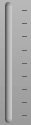
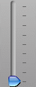
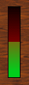
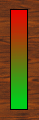
The slider is similar to the IMAGE_PARAM_LINEAR_METER widget for its graphical properties.
Let's start with an example without a thumb. The result looks like a IMAGE_PARAM_LINEAR_METER except that the user can interact with the widget and change its value. Using the “hand” cursor makes it easier for the user to understand the difference with a meter.
<?xml version="1.0" encoding="utf-8" ?>
<SKIN language_version="1.0" background_image="bg.bmp" repeat="true" h_margin="10" v_margin="10"
	layout_type="row" spacing="0" font_quality="cleartype">
	<IMAGE_PARAM_SLIDER param_id="dsp.input1" image="linear_meter.bmp" cursor="system::hand" />
</SKIN>
| (the pictures show the widget for different values of the parameter) | ||
|---|---|---|
|
|
|
|
|
0% |
50% |
100% |
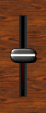
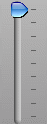
Another example with a thumb: since the thumb image is not symmetric (because of the shadow), we need to tell the skin system where the center of the thumb is in the image in order to have the thumb properly centered on the channel. Note the hand cursor which makes the cursor change when the user is on an active zone of the slider:
<?xml version="1.0" encoding="utf-8" ?>
<SKIN language_version="1.0" background_image="bg.bmp" repeat="true" h_margin="10" v_margin="10"
	layout_type="row" spacing="0" font_quality="cleartype">
	<IMAGE_PARAM_SLIDER param_id="dsp.input1" image="slider_small.bmp" thumb_image="slider_thumb.bmp" thumb_h_center="12"
		thumb_v_center="7" cursor="system::hand"></IMAGE_PARAM_SLIDER>
</SKIN>
The Folder contains the following files:
|
|
|
|
slider_thumb.bmp
|
|
|
slider_small.bmp
|
|
|
slider_thumb_mask.bmp
|
The result is the following:
| (the pictures show the widget for different values of the parameter) | ||
|---|---|---|
|
|
|
|
|
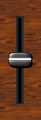
0% |
50% |
100% |
We can now add some images to make the slider 'alive': first we add a slider_selected.bmp image to the folder so that it looks like there is a background light in the slider when it moves. Then we can add a 'slider_thumb_hi.bmp' image which represents an highlighted thumb. We will affect this image to the hover and focus states so that the thumb is highlighted when the slider is active. We could also have used two copies of this image named slider_thumb_focus.bmp and slider_thumb_hover.bmp and rely on the automatic naming convention of the skinning language (see about images section), but to save memory and for the purpose of the example we did not:
<?xml version="1.0" encoding="utf-8" ?>
<SKIN language_version="1.0" background_image="bg.bmp" repeat="true" h_margin="10" v_margin="10"
	layout_type="row" spacing="0" font_quality="cleartype">
	<IMAGE_PARAM_SLIDER param_id="dsp.input1" image="slider_small.bmp" thumb_image="slider_thumb.bmp" thumb_image_focus="slider_thumb_hi.bmp"
		thumb_image_hover="slider_thumb_hi.bmp" cursor="system::hand" thumb_h_center="12" thumb_v_center="7"></IMAGE_PARAM_SLIDER>
</SKIN>
The result is the following:
| (the pictures show the widget for different values of the parameter) | ||
|---|---|---|
|
|
|
|
|
0% |
50% |
100% |
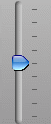
Let's now have a look at the margin_before and margin_after feature of the slider. It just works the same as for the IMAGE_PARAM_METER object, except that it refers to the position of the center of the thumb here. In the following example, both background and thumb are asymmetric, so we use the 'h_center', 'h_thumb_center' and 'v_thumb_center' attributes to make them aligned. Then we use the margin_before to set the number of pixels before the beginning of the slider for the thumb center (bottom), and the margin_after to set how many pixels should be left on top of the center of the thumb when the slider is at its maximum value:
<?xml version="1.0" encoding="utf-8" ?>
<SKIN language_version="1.0" background_image="aqua_bg.bmp" repeat="true" h_margin="10">
	<IMAGE_PARAM_SLIDER param_id="dsp.input1" image="channel.bmp" thumb_image="aqua_thumb.bmp" cursor="system::hand"
		thumb_h_center="8" thumb_v_center="9" h_center="8" margin_before="10" margin_after="10"></IMAGE_PARAM_SLIDER>
</SKIN>
The Folder contains the following files:
|
|
|
|
aqua_thumb.bmp |
|
|
channel.bmp |
|
|
aqua_thumb_mask.bmp |
The result is the following:
| (the pictures show the widget for different values of the parameter) | ||
|---|---|---|
|
|
|
|
|
0% |
50% |
100% |
Thanks to these attributes the thumb is perfectly aligned with the top and bottom ticks of the background.
In the case we would like to limit the number of possible values to the number of ticks (there are 9 here), or to any arbitrary value, we just use the 'positions_count' attribute. Here is the same example as above with the number of positions set to 9: the slider will move from tick to tick only (no possible intermediate value):
<?xml version="1.0" encoding="utf-8" ?>
<SKIN language_version="1.0" background_image="aqua_bg.bmp" repeat="true" h_margin="10">
	<IMAGE_PARAM_SLIDER param_id="dsp.input1" image="channel.bmp" thumb_image="aqua_thumb.bmp" cursor="system::hand"
		thumb_h_center="8" thumb_v_center="9" h_center="8" margin_before="10" margin_after="10" positions_count="9">
	</IMAGE_PARAM_SLIDER>
</SKIN>